Hugo's Table of Contents
If you’ve read my earlier blog entries, you’ll know that I don’t intend for HugoModo to supplant Hugo. I call it a ‘framework’ but it’s really just a collection of themes. The aim is not to require a radically different, custom setup, but to work by-default with any Hugo site. And a part of achieving that is to do things the Hugo way, which means if a feature exists natively in Hugo I ought to utilise it, rather than provide an alternative that fragments HugoModo from the Hugo foundation it’s built on.
So… Hugo has this Table of Contents feature built in. Beautiful! If you have headers in your content markup, it just works. It creates a list from those headers, wraps that list in links and a ul element, and you’re done - instant table of contents.
That would be fine if I weren’t also intent on making HugoModo semantically correct and valid HTML. Y’see… I’ve taken a bit of a workaround in my content files. To explain the situation, we need to talk about headers and we should begin with the site layout files.
Site and Article Titles
Every page on HugoModo features two titles by default: the title of the site and the title of the current page. Stripped of all other markup, they look like this:
<h1>Site Title</h1>
<h2>Article Title</h2>
Because h# elements are more than just stylistic, they’re a semantic element parsed with meaning by search engines, there are some best practises as concerns their levels and nesting them. So given that my article titles use h2, then if I’m using any additional headers in my page content I will tend to start at h3.
<h1>Site Title</h1>
<h2>Article Title</h2>
<h3>Site and Article Titles</h3>
<p>Every page on HugoModo features two titles by default...</p>
With this approach, the page remains nice and semantic and easily parsed by web crawlers for search engine indexing.
The Table of Contents
To include a table of contents in a layout in Hugo, one simply adds this:
{{ .TableOfContents }}Quick, simple, automatic. And as described above it will wrap found headers in a list and anchor links, a bit like so:
<ul>
  <li>
    <a href="#site-title">Site Title</a>
    <ul>
      <li>
        <a href="#article-title">Article Title</a>
        <ul>
          <li>
            <a href="#site-and-article-titles">Site and Article Titles</a>
          </li>
          <li>
            <a href="#the-table-of-contents">The Table of Contents</a>
          </li>
        </ul>
      </li>
    </ul>
  </li>
That’s all automatic: nesting levels, anchor links, all of it. And in the example above, you can see no nesting level has been skipped…
…but I’ve cheated there. ‘Site Title’ and ‘Article Title’ are not in the content. Those are stored and rendered separately as properties of the page. The first title in the content is actually ‘Site and Article Titles’, and it’s a h3. The actual output for this page at present would be:
<ul>
  <li>
    <ul>
      <li>
        <ul>
          <li>
            <a href="#site-and-article-titles">Site and Article Titles</a>
          </li>
          <li>
            <a href="#the-table-of-contents">The Table of Contents</a>
          </li>
        </ul>
      </li>
    </ul>
  </li>
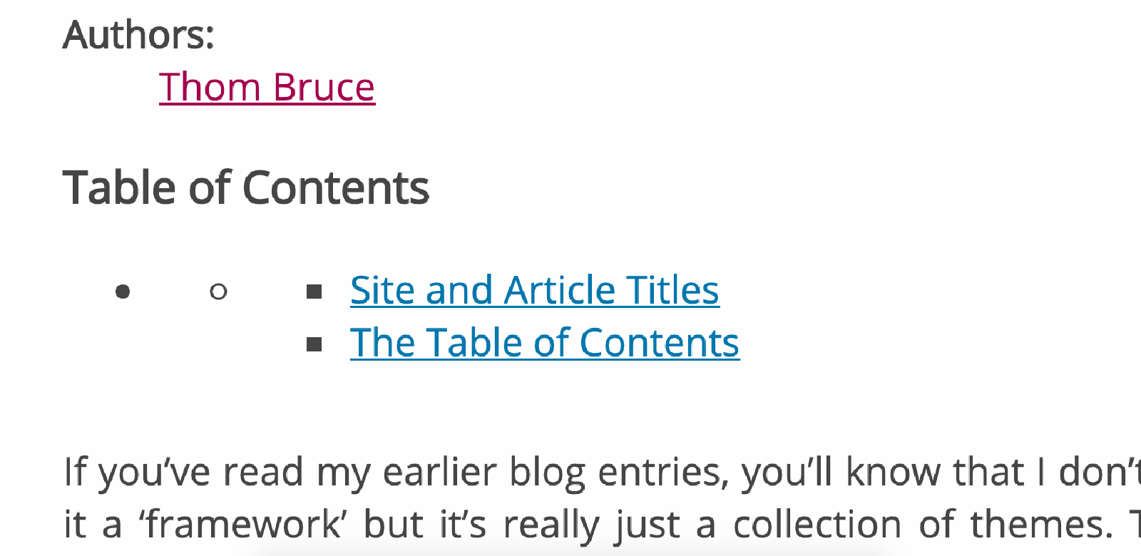
The table of contents nests our list two whole levels before we get to our h3 titles. The result is… ugly:

As you can see, we get two additional and unnecessary levels of nesting by default.
A Semantically Dirty Solution
The quickest way to resolve this is to do what actually I imagine end users will wind up doing, particularly non-technical users. That is to just start content titles at h1 and suffer the invalid HTML warnings, and perhaps also the small hit to SEO.
<h1>Site Title</h1>
<h2>Article Title</h2>
<h1>Site and Article Titles</h1>
That will clean up our table of contents, but I don’t consider it an option. HugoModo should support semantically correct HTML by default, and it shouldn’t require an SEO hit just to provide cleaner presentation.
There’s got to be a better way.
A Better h1
Okay, so maybe the problem is a little with my layout. We should take the opportunity to think a little about what an h1 should be. As search engines are going to consider this the most important header in indexing a page, it clearly makes sense to give priority to the page title - at present, I’m favouring the site title.
The actual SEO improvements for this will be negligible if they exist at all. And we’ll have to restyle our site title so it still appears like a leading header on the page, even though semantically it no longer is. Bootstrap has display headings for just this purpose, so I’ll follow their lead and use display-1 in place of h1 in my example below:
<strong class="display-1">Site Title</strong>
<h1>Article Title</h1>
<h2>Site and Article Titles</h2>
Okay, a decision to explain there. I’ve use strong for the site title because this semantically suggests that the enclosed text is important. In design, we might often use it just to make text bold… but this isn’t actually its intended use. It does that, yes, but we can restyle it any way we choose to remove the bold properties. We should - and this is what I’ve done here - use it to mark important text, regardless of styling. (This choice may change when I come to do my accessibility overhaul, but for now it stands as reasonable.)
Next, I’ve used h1 for the article title. Feels like the best choice as regards SEO and properly indexing the page. Probably best for accessibility too.
But… a problem. My content titles now start at h2. One fewer levels of nesting, yes, but still we haven’t entirely resolved that table of contents issue.
So let’s look at what we have to support.
Two Kinds of People
Let’s assume that developers, designers and technical users like myself will follow best practices and start their content titles at h2:
<h1>Article Title</h1>
<h2>Site and Article Titles</h2>
Those are our first kind of person.
Our second kind are end users, non-technical website owners for whom the first kind of person have built a site using HugoModo. They are likely to give less consideration to header levels, and they will wind up breaking HTML validity, possibly accessibility and SEO this way, but we can’t save everybody, right? They’re going to start with h1 and nest downwards from there.
<h1>Article Title</h1>
<h1>Site and Article Titles</h1>
Invalid, but they actually get the benefit of a prettier table of contents before I’ve even fixed the styling in a step to come.
h1 is like h2 or h1.5
Quick note: Regardless of the theme or framework I’m using, the use of h1 is still going to result in BIG STYLING of the text. A little quick fix for that (not tested) might be:
h1:not(:first-of-type) {
  @extend h2;
}
…maybe. Just thinking out loud here. This will (or should) at least get any h1 but the first on the page to adopt the styling rules of a h2 instead.
But actually… We don’t want it to be identical to an actual h2. We do still want to respect those users’ nesting decisions. So probably better, rather than @extend h2 to do something more like font-size:2.25em; or whatever styling choices we have to make to have the result stylistically appear to be a “h1.5”, with size and weight somewhere between the main h1 and an h2.
No Headers
There’s a little more to my template for a table of contents than just Hugo’s {{ .TableOfContents }}. I’ve added it to an aside and given it its own title, a h2 element. While the table of contents itself won’t render unless there are headers, we also want it to be the case that the aside, header and whole component do not render if that’s the case too.
Fortunately, we can also use the template function as a conditional and check it like so:
{{ if .TableOfContents }}
  <aside>
    <header>
      <h2>Table of Contents</h2>
    </header>
    {{ .TableOfContents }}
  </aside>
{{ end }}
Easy peasy. Hugo’s docs suggest a different conditional:
{{ if and (gt .WordCount 400 ) (.Params.toc) }}That would prevent rendering the block on articles shorter than 400 words and where a toc variable has been left unset or set to false. I’ll come back to this consideration later, maybe combine my check with this one so that we ultimately don’t render it for short content, content without headers or content where toc is false. For now, I’ll stick with just the no-headers check.
The Current State of the ToC
That second type of person, who’ll be using h1 through their content will already now get a table of contents without the empty levels of nesting.
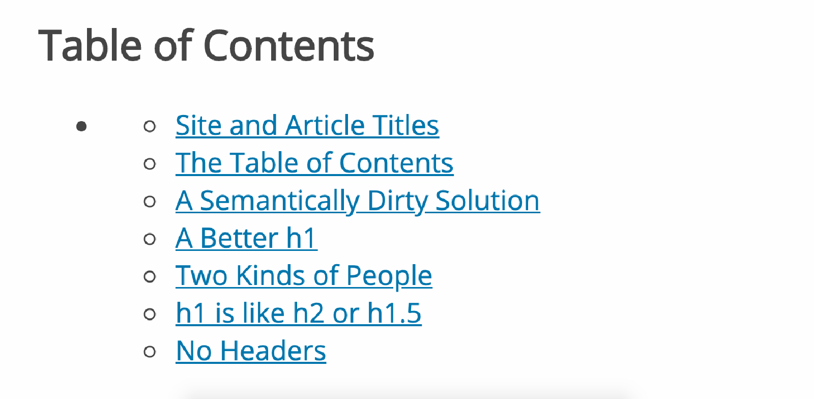
Meanwhile, I’ve changed most of the content files on this site to begin with h2 and the result is…

It’s better than where we were. We still need to resolve that nesting issue, but it’s only the one level now… should be easier.
We can’t just be rid of the first nesting level, as our type 2 people will then be missing a level. So we’ll have to style it in such a way as it remains present but is practically invisible.
So first things first, let’s get rid of the bullet points. They have got to go. We’ll also get rid of indentation and… maybe bring it back afterwards based on certain conditions, but we might also consider denoting the nesting level using font-size instead.
nav#TableOfContents {
  ul {
    padding:0;
    list-style-type: none;
    font-size:0.95em;
  }
}
That removes the indentation, removes the bullets and reduces the font-size on the ul elements contents. At this point, it would be useful to have the whole range of header elements to play with to ensure that the font-size never gets too small. em adjusts the size relative to the containing element, so each subsequent level will be, with the above style rules, 5% smaller than its parent. Let’s just throw down some dummy headers here:
Header 2
Header 3
Header 4
Header 5
Header 6
Adding Some Distinction
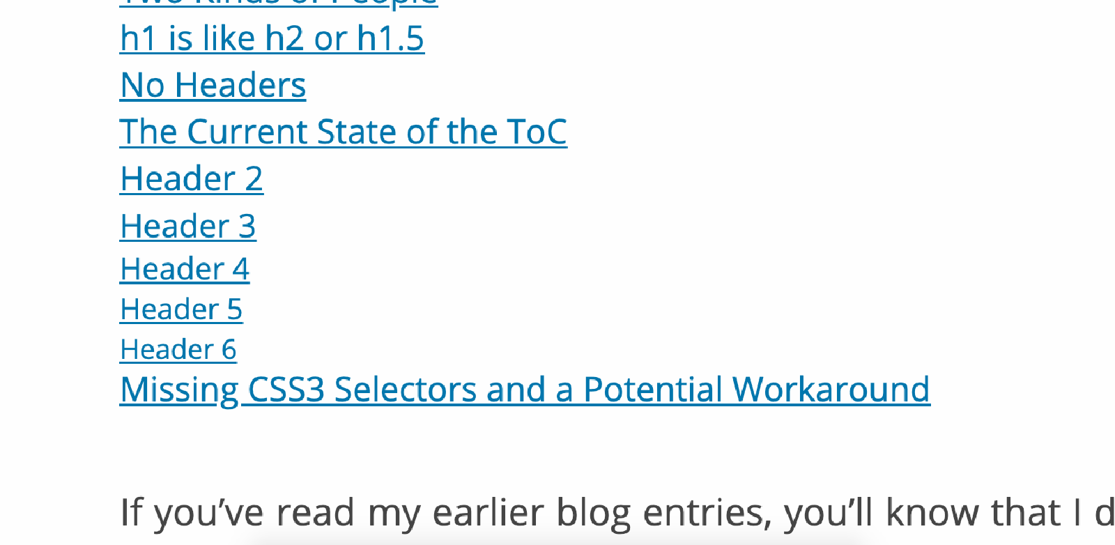
The results of the styling above and the use of header levels down to level 6 is this:

That doesn’t look so bad. Incremental header steps don’t appear to change much in size, but there’s a clear difference between h2 and h6. And h6 isn’t so small as to be unreadable. 0.95em was probably the right choice for a quick fix, but will likely see some modification per theme.
The fact that incremental changes aren’t great is in our favour too, as the discrepancy between h1 and h2 isn’t great enough to be a problem for our two types of people.
I want to re-add indentation now to add a little clarity, and I can’t pull off the same trick here. If h2 is our starting header, we want 0 padding on that. We can’t just add the padding to our ul rule, as even the empty levels still exist. The result is that menu items starting at the second or third level of indentation produce this unexplained margin when we’d prefer the “top level” item to be flush with the page title and content by default.
Missing CSS3 Selectors and a Workaround
One thing would be useful here which has been considered for the CSS spec before being abandoned: a content selector. If CSS had such a selector, we could use it to select the menu container based on the content it has, in our case determining that it lacks a link and is therefore an empty nesting level.
That isn’t in the spec. And neither is a parent selector, which we could alternatively use to select only li elements that are the parent of an a element.
What we can use is the adjacent sibling combinator. So to add padding to subsequent levels that are not children of an empty level, we’ll do this:
a + ul {
  padding-left:1em;
}
As Good as it Gets… For Now
I’ve worked on this problem long enough for today and I’ve reached something I’m satisfied with. In the final result, I’ve commented out the font-size adjustment because I don’t feel it was adding anything. I may revisit - perhaps a second level decrease followed by subsequent levels at the same size would be preferable.
Here’s the final SCSS:
nav#TableOfContents {
  ul {
    padding: 0;
    list-style-type: none;
    // font-size:0.95em;
    a + ul {
      padding-left:1em;
    }
  }
}
Yep, that’ll do.
I would be eager to reintroduce list-style-type as decimals for the top level followed by roman numerals beneath. But I’m slightly concerned by the results of an experiment in doing that. It works, but we also wind up with the decimal numbers for empty levels as well. Although with the positioning choices I’ve made, you can’t necessarily see them as they are covered by identical lower-level decimal numbers. But they are there… and I can’t yet think of a solution for that.
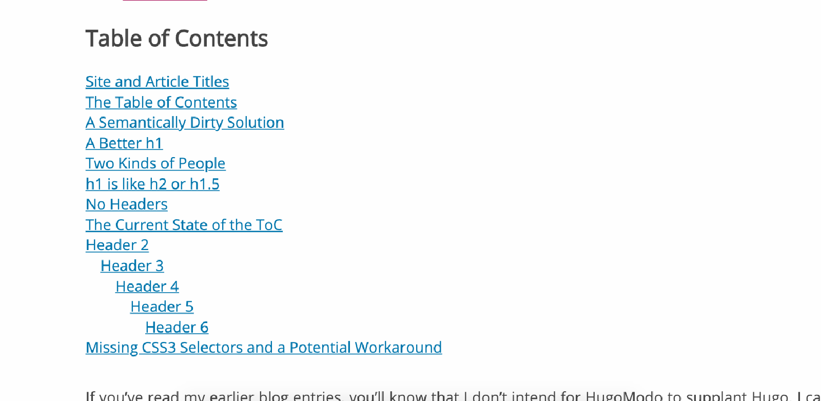
Regardless, here we have the finalised presentation (for now) of our table of contents:

Looks… good enough. It will be modified by themes, and that’s the next step for me - make sure it hasn’t broken the display of any of my current themes.
Next Steps
- As mentioned, I’d like to get numerals working without them also being displayed for empty levels. If I can find a pure CSS solution to this, I’ll implement it.
- At the moment, this will display by default if a page’s content contains headers. We should add the potential to turn it off/on with two variables:
- .Params.include_toc
- .Site.Params.include_toc
Usually, I add HugoModo variables to a separate data file, but in this case the variable comes from Hugo’s own docs so it seems more appropriate to follow the pattern they establish for it there.